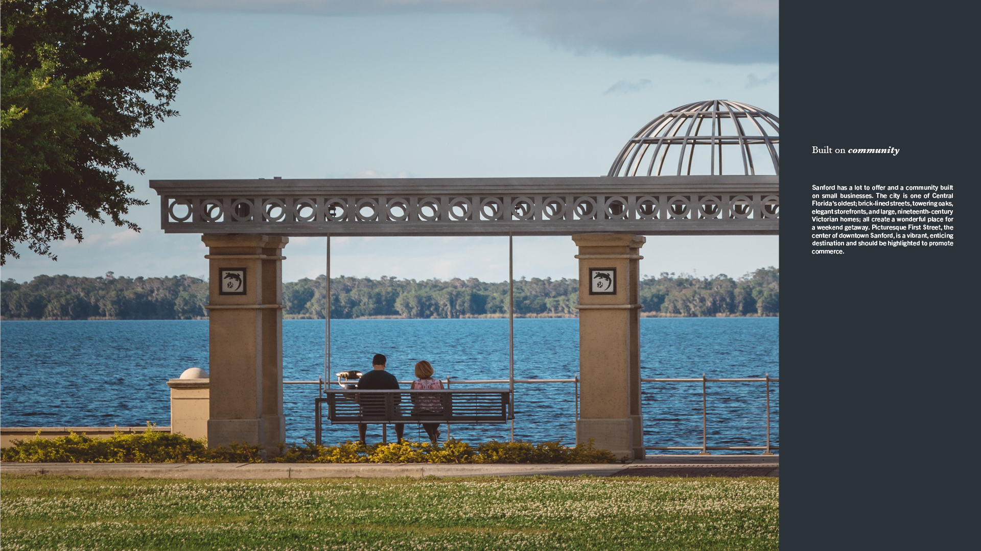
Known as the “historic waterfront gateway city,” Sanford sits on the southern shore of Lake Monroe at the head of the St. Johns River. It is considered by many as one of the most culturally rich and historic cities in Central Florida due to its past importance in the agricultural and shipping industries. However, in recent decades, Sanford has become overlooked as the tourism industry in Orlando has grown.
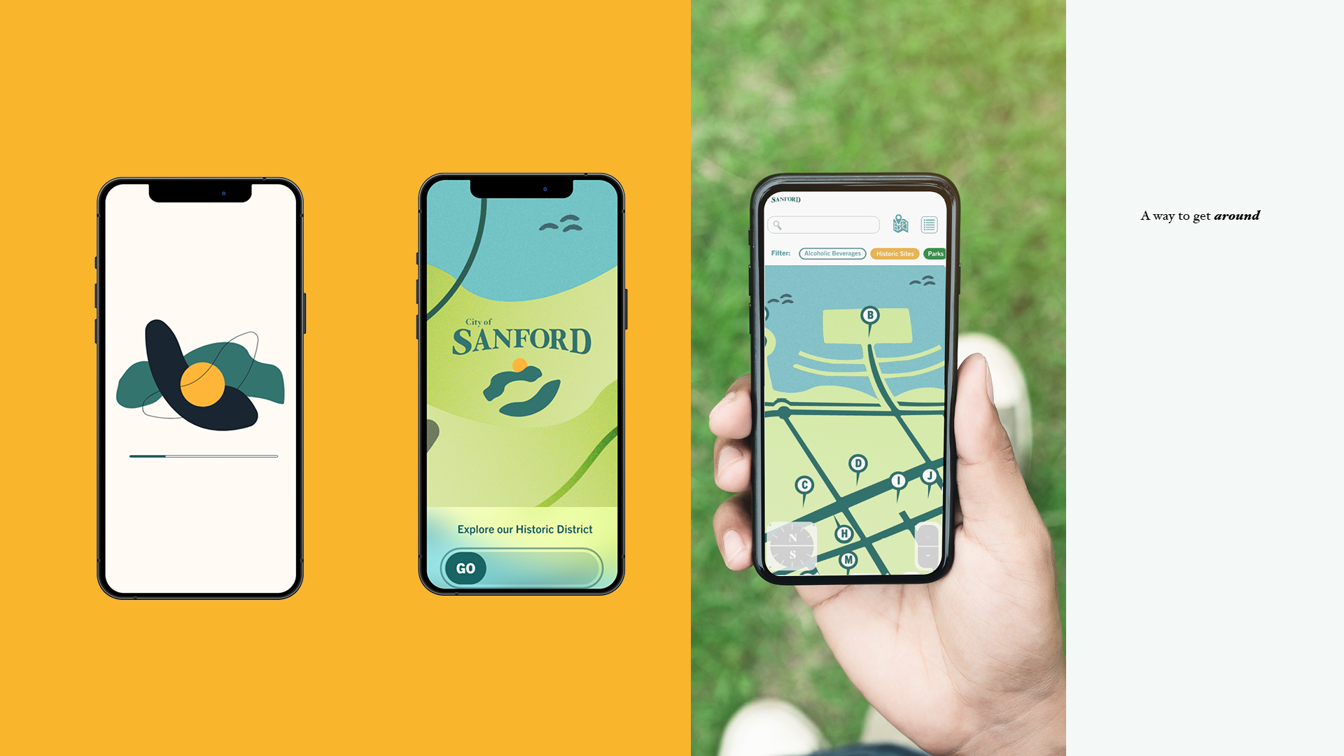
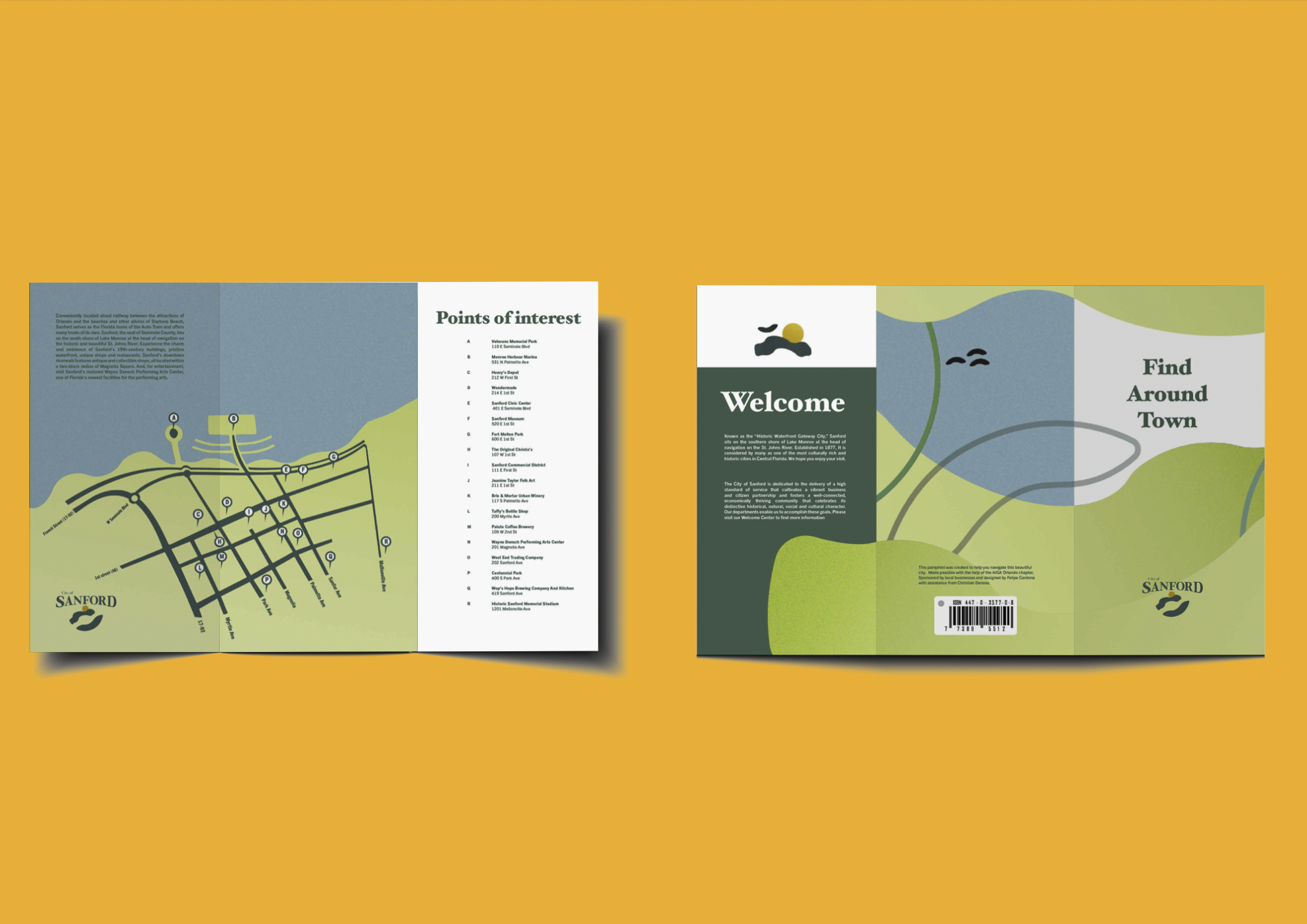
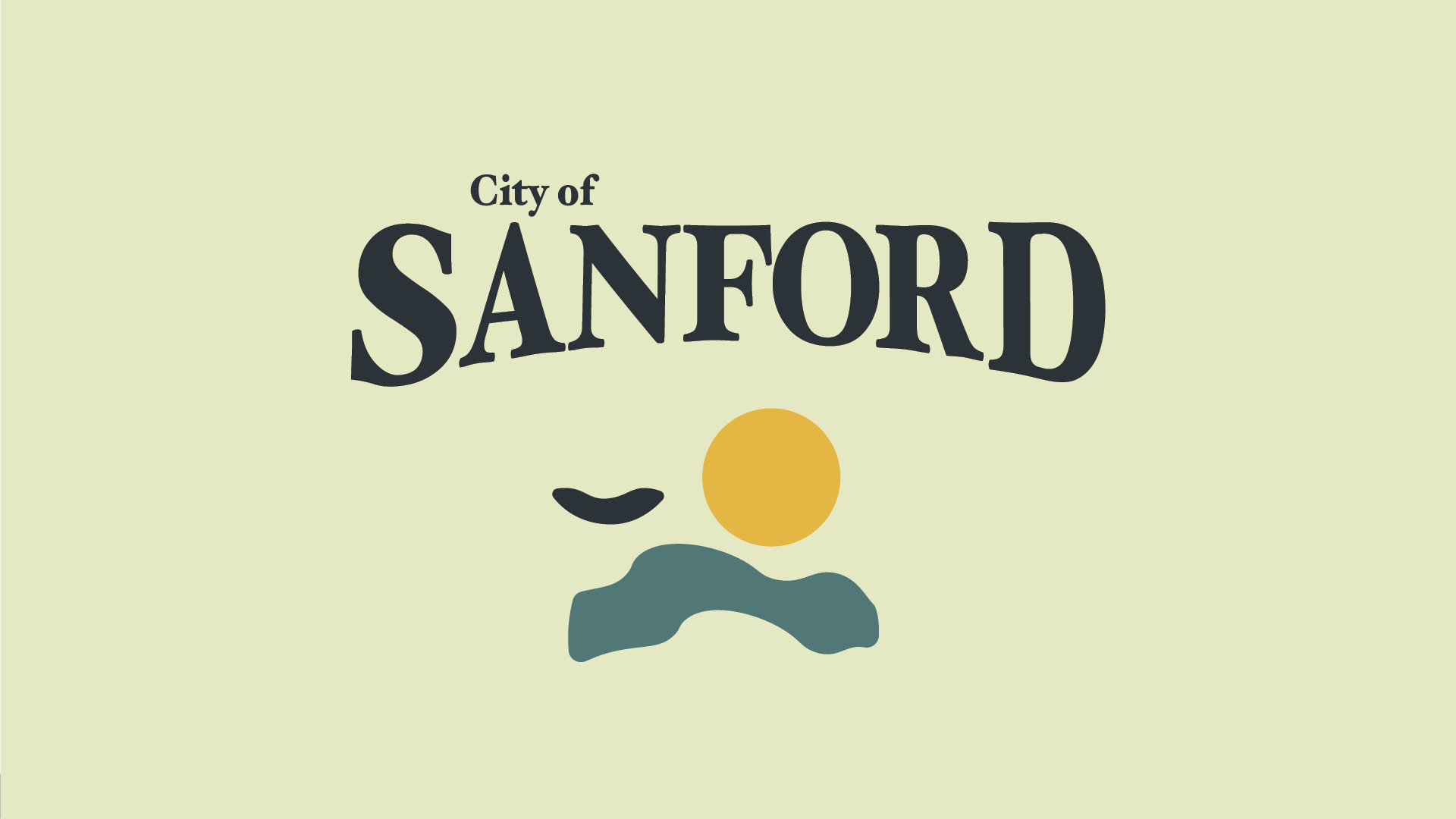
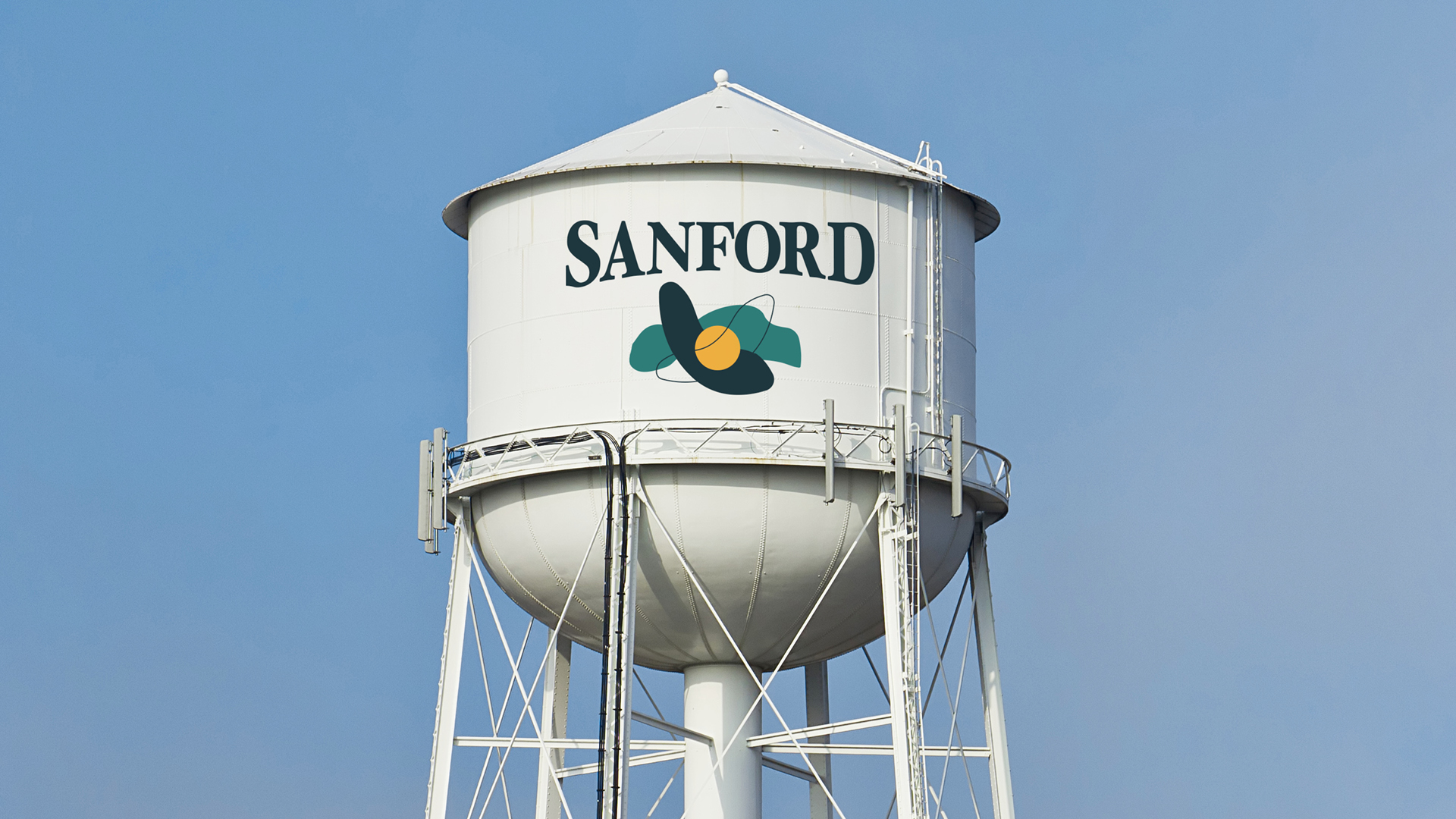
This wayfinder project was created to rebrand Sanford, showing both its rich history and its exciting present day, including parks, shops, bars, restaurants, and landmarks. The design of the app and pamphlet are meant to both represent the city and compliment each other. The warm colors reflect the hospitality of the people and environment. Shades of blue, green, and yellow mirror the waterways and trees that Sanford has long been known for. The new logo also depicts Sanford’s geography, using organic lines and shapes to evoke the lake and river while also suggesting the development of the city. While incorporating natural elements in the branding, the typeface is clean and established toshow the credibility of the city. Finally, texture was added to the map and pamphlet to create a historic feeling and to suggest the brick-paved streets.
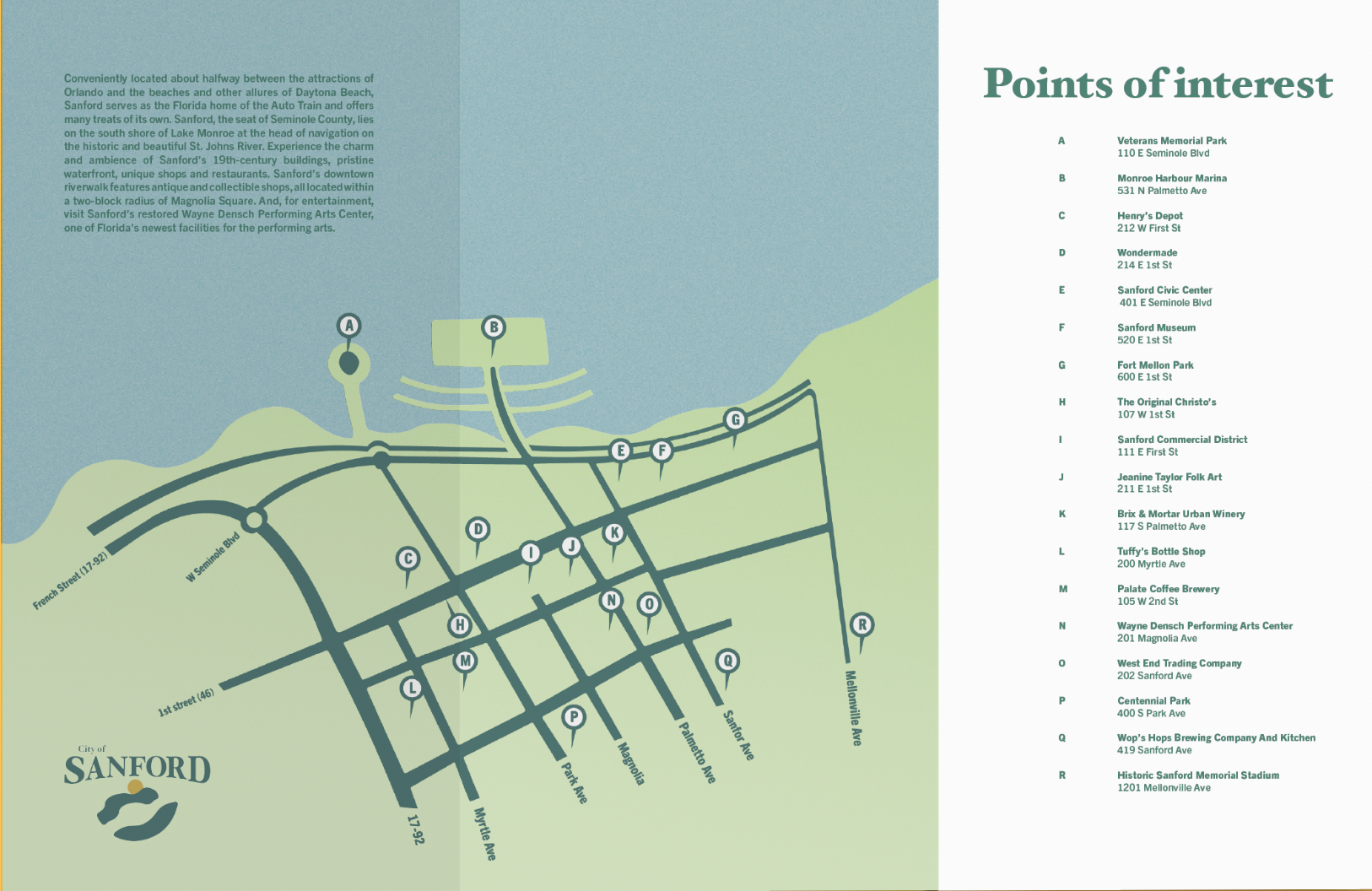
This app will allow visitors and locals alike to easily navigate Sanford and interact with the community through its recommended locations. This rebrand will also change the perception that Sanford’s greatest days are behind it and showcase the innovative work of business owners and artists who bring new culture and excitement to their community.