Nurturing
Hope
A nonprofit identity system about care, trust, and expansion.
Nurturing Hope is a faith-rooted nonprofit organization serving communities in Kenya through education, holistic care, and sustainable development. When I worked with the founders, the organization was still early in its public identity and needed a brand system built from scratch.
My role was to design the identity in collaboration with the founders, translating their aesthetic vision into a mark and visual system that could feel warm, credible, and useful across different audiences.
Goal
The goal was total branding and identity design: a mark that could identify the organization with care and credibility, while giving the brand room to expand across programs, outreach, events, printed materials, merchandise, and future ventures.
The identity had to feel approachable to the people it served and trustworthy to donors, partners, and supporters. It could not feel too corporate, too cold, too child-focused, or too narrowly tied to one type of nonprofit work.
Scope
- Brand strategy
- Logo and mark exploration
- Visual identity system
- Typography and colour direction
- Application mockups
- Future expansion thinking
- Collaboration with the founders around tone and aesthetic direction
Why it matters
Nonprofit identities carry more than recognition. They have to communicate care without becoming soft or cliché, legitimacy without becoming cold, and flexibility without losing the core mark.
For Nurturing Hope, the identity also had to work across cultural and practical contexts. It needed to support an organization serving Kenyan communities, while also communicating clearly to donors and partners who might encounter the brand through a website, printed piece, shirt, letterhead, flag, pin, or future program.
The strongest design challenge was balancing community warmth with institutional trust. The brand needed to feel human and approachable, but also stable enough to represent an organization people could believe in and support.
Proof examples
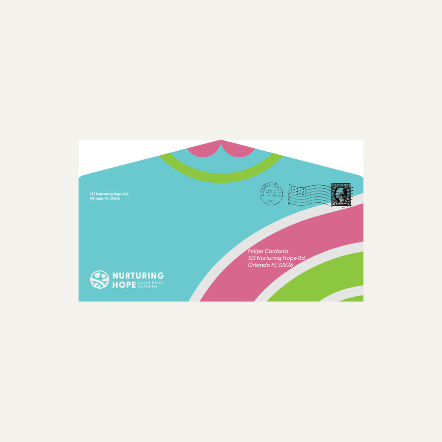
Building the system
The final identity needed to work beyond a single logo file. I tested the mark through practical uses like stationery, apparel, and lockups so the system could feel real and usable.
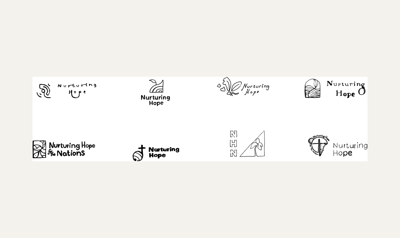
Finding the mark
The early exploration was about finding a symbol that could hold care, growth, and structure without becoming generic nonprofit imagery.
Knowing what to leave behind
Some early directions leaned too soft or too child-oriented. That helped clarify that the identity needed more range than a brand only coded around children.
Final mark
The selected direction gave the organization a mark that could stand on its own while supporting a larger identity system.
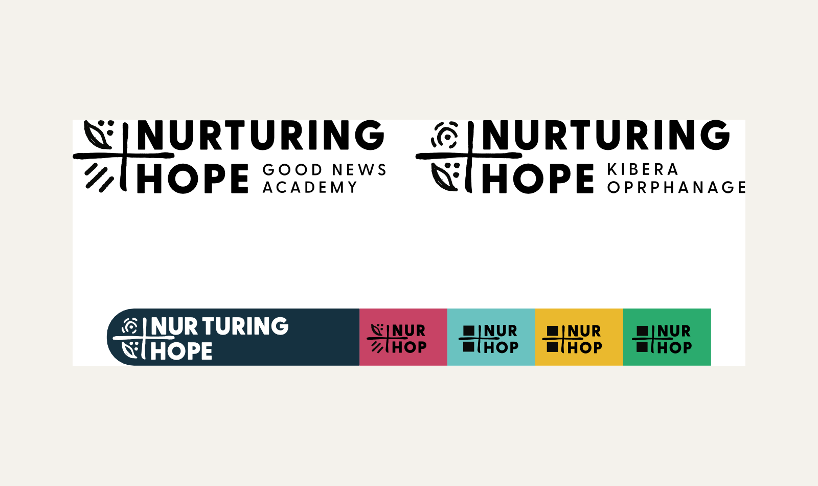
Room to grow
The system was built with expansion in mind, so Nurturing Hope could adapt the identity across future programs, ventures, and communication needs without starting over.